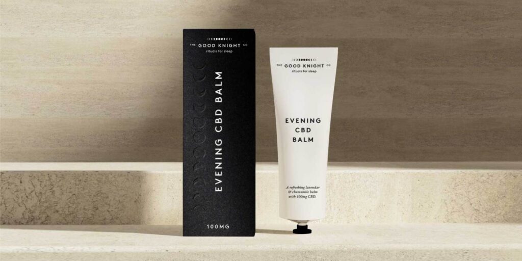
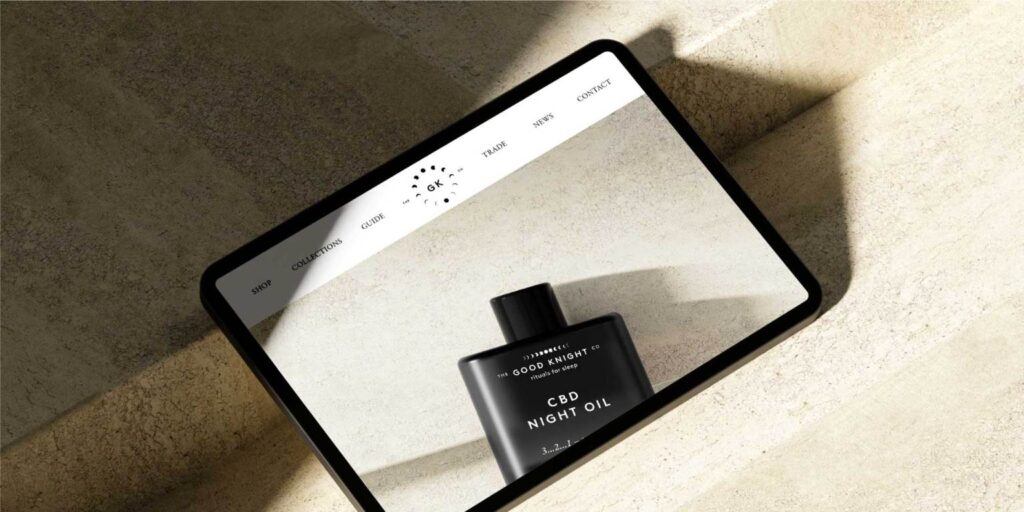
Our work successfully brought The Good Knight Co to life as an aspirational functional consumer product range. The brand is distinctive but minimal, projecting confidence and sophistication. The cohesive design system across SKU’s reinforce the brand’s promise of quality and functional benefit, making it a desirable addition to any nighttime routine.
“Everyone has commented on the brand and packaging and how absolutely spot on it is – great work!” – Charlie (The Good Knight Co)