Menu
Close


Menu
Close
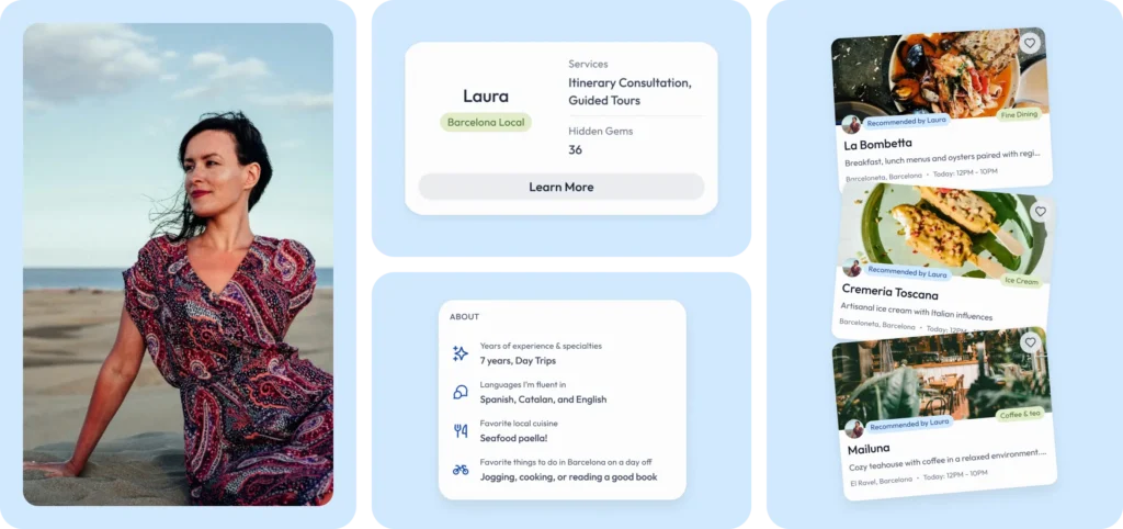
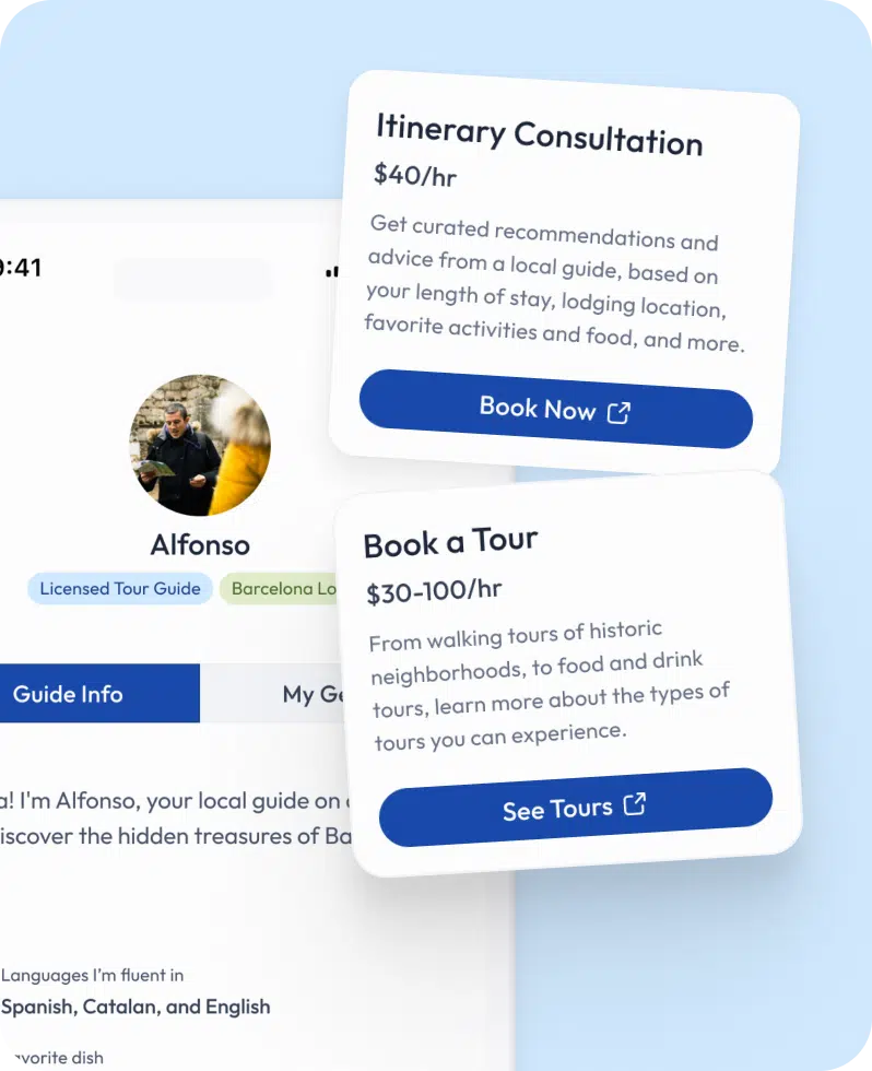
Ensuring authenticity in hidden gem recommendations was our priority, considering the prevalence of sponsored content dominating travel recommendations. To achieve this, we allowed guides to share personal details, inspired by successful models like Airbnb, enhancing the authenticity and trustworthiness of their profiles.
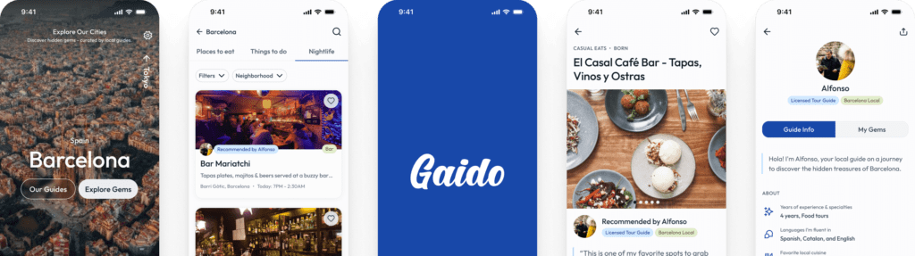
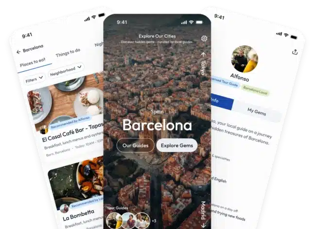
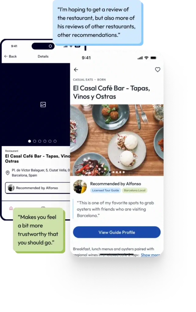
During moderated usability tests of our lo-fi designs, participants expressed a keen interest in learning more about the guides and their role on the platform. They wanted insights into the guides’ backgrounds and motivations for providing recommendations, as well as opportunities for interaction. In response, we made the guides’ role more visible in the app’s interface in our hi-fi designs, allowing them to write thorough descriptions explaining why they were recommending specific spots. This personal touch not only distinguished Gaido from other travel products but also added credibility to the recommendations.
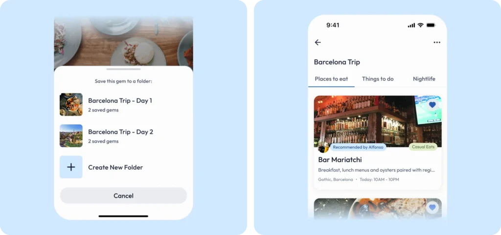
One of the design challenges we faced was figuring out the best approach for building a planning tool for our MVP. Initially, we assumed that users would want a dynamic itinerary builder to plan their daily trip activities. We envisioned a feature-rich tool that would allow travelers to meticulously detail their daily schedules to incorporate their favorite hidden gems in their agenda. However, during user interviews, we discovered that people were relatively casual with their planning. Most travelers preferred loose itineraries, if any at all. This revelation prompted us to rethink our approach and pivot towards a simpler, more flexible planning tool for Gaido.
We transitioned to a simpler planning tool that allows users to outline their travel as loosely or as detailed as they prefer, without overwhelming them with unnecessary features. Our solution of letting users create Pinterest-like sets of folders to group their favorite hidden gems gives travelers the flexibility to organize them however they see fit, aligning with their varying planning styles while maintaining ease of use.